Adobe Creative Jam x Activision
Back in early May, I came across the Adobe Creative Jam x Activision event. This was the perfect opportunity for me because I was planning on working on projects over the summer. I also love video games and am very interested in the industry, so I was very excited about this Creative Jam. However, as I did not have many designer friends, I struggled to find a group to participate with. After searching online and with the help of my friend, I found the design community Design Buddies on Discord. There, I asked the group if anyone would like to join me in participating in this Creative Jam and quickly found my groupmates Jack and Rahida! This was the first time I worked with people I met for the first time online, but it could not have been any better. We got along well and tackled this 48-hour designathon and I learned so much from this.
My Role
UX/UI Designer, UX Researcher
Team
Two other UX Designers
Timeline
May 2021 (48 hours)
Tools
Adobe XD, Miro
About Creative Jams
The Adobe Creative Jam is a series of competitions where teams come together to design an entire app experience. The competitions are usually in a partnership or sponsored by a company. Teams are given a problem statement and set off to use Adobe XD to ideate, design, and prototype their solutions all in 48 hours.
The Problem
Create a proficiency-focused app experience to inform new gamers about video games based on age-appropriateness and skills such as reading, hand-eye coordination, fitness, personal accountability, multi-tasking, problem-solving, memory, attention, concentration, social skills and more. This third-party mobile app must cater towards: Adults discover games that fit their interests and time allotted
User Research
While not mandatory for this competition, we decided that our solution can only be as successful if we have the reasoning to back our solution. While we were not able to conduct long research, we still created a Google Form to collect as many responses as we could in five hours. Thank you to 80+ friends and family who allowed us to understand our audience better!
Brainstorming, Content Hierarchy, User Flows
After reviewing all the responses, we realized that many people play games because of their friends. Either friends have recommended them to start playing a game or they started playing a game to stay connected to their friends. We found this friend component to be very powerful, so we brainstormed around several questions:
-
How do we allow people to learn about what games their friends are playing?
-
How do we bring in people who don't have friends who play games?
-
How can people make friends with those who are playing the same game?
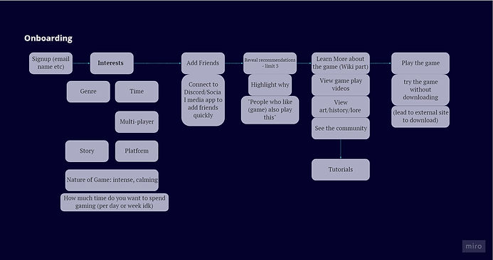
After throwing down different ideas and questions, we started creating user flows and the content hierarchy for the app. We wanted to focus on allowing the users to only focus on exploring a couple of games at a time, since being overwhelmed was one of the reasons why many people did not start playing a game. We also wanted to encourage the users to try out a game before they decide if they liked it or not, and allow users to understand the game more by interacting with others who are also new to the game. Since the gaming community can be quite daunting and toxic (say on Reddit or Twitter), we wanted new gamers to feel welcomed and safe.

.jpg)
Mapping out a user flow not only helped us understand exactly what functions we needed in the app, but we were able to also tell a more compelling story through the prototype.
.jpg)
Wireframe and Style Guide
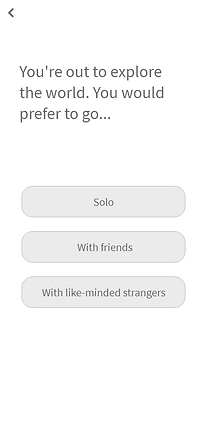
We spent some time wireframing our app so the three of us understood how we each envisioned the app. We all split up different sections to wireframe and came back to debrief our design. I also created a style guide to help us stay consistent while designing the high fidelity prototype. At first, we were unsure if this step was necessary because we were already low on time. After finishing the wireframes though, we realized how helpful the wireframes were because we were able to understand exactly how many screens to design, what features we needed to include, and got a peek of what everyone's design style looked like. We were also able to run through our wireframes with some of our friends to test if this app flows well and works as how we intended.


%20%E2%80%93%201.png)
High Fidelity Prototype
After spending some time revising from our feedback and discussion, we began our final prototype. It took a lot more time than we had planned, but we all worked diligently to get all the necessary screens out.
GLHF (Good Luck Have Fun) is an app that connects friends and other new players together to find and play games together. We encourage those who are looking for games to play as well as those who already play games to join the app so that you can always see what games your friends are playing. For our prototype, we only focused on the flow of someone who is looking to find a game to play.
Results & Takeaways
We won one of the 10 Honorable Mentions out of the 305 projects submitted, placing in the top 6%! This experience has taught me a lot as this was the first time I've designed a fully functional prototype for an app. I've learned skills to design from data, iterate, and prototype quickly. I'm really proud of our group coming together as strangers and working so well together to design a successful prototype together! It was definitely a rewarding challenge.